

Unless it’s a tavern or bakery preserved in Williamsburg, no building can escape modernization forever. The Pi Web site “building” is no exception. Though its structure has served the organization well over the years, the “Web Standards” revolution made the idea of a redesign seem more compelling than the previous daydreaming and thoughts of “some day.” When Lawrence Charters, long time Pi Webmaster extraordinaire, asked me to take a look at the current pages, I enthusiastically took on the challenge to tear down the structure of the site and give the content a more modern look.
Lawrence and I exchanged a flurry of emails so we could come to consensus on some key issues. Would we eschew tables in favor of Cascading Style Sheets Positioning (CSS-P)? How far back did we want to go in browser support? What color scheme did we want to use? Should we keep or scrap the current logo? How many images did we want to include? What would we do with all of the text on the opening page? In this article, I hope to share our thinking about how we answered these and other questions.
The old Pi Web site banner included the traditional logo, with text to the side describing the Pi. The logo itself was a mixture of black, brown, tan, white and red.
Lawrence put copies of the important Pi pages on a testing server and I flipped through enough of the pages to sort out ideas and develop recommendations. Lawrence was firm about Netscape 4.x support, and I assured him that that would be easy to provide. Other than his wish to accommodate this older browser, however, he gave me license to go as modern as I pleased. All the way, I asked? He gave an enthusiastic “yes!”
At the outset, then, we decided on “Web standards,” XHTML, Cascading Style Sheets for design, and minimal images for low page weight. I chose a nifty little navigation system devised by Al Sparber’s Project Seven to give both some “gee whiz” factor and to solve the “links out of control” problem. We also decided to keep the red, white, and blue Pi color scheme, modify the logo somewhat (but keep its essential character), and attempt to keep as much of the voluminous text on the opening page as possible. Let’s look with a little more depth at how we accomplished all of this.
If you read my article “Building Your Dream House” in an earlier Journal, you would know a little about Web Standards. In a nutshell, Web Standards attempt to bring some sanity—if not the promise of some consistency— to the Internet Web experience. Care in the choice of browser-crashing bells and whistles, consideration for the disabled, concern for page weight and download times, separation of design and content, and, when followed to the letter of its laws, full use of Cascading Style Sheets for page layout, are all aspects of the Web Standards revolution.
The development of HTML stopped with 4.01, and XHTML is now the markup language that the W3C (World Wide Web Consortium) promotes. Though many, and probably most, Web pages still use HTML 4.01 or even HTML 3.2 (Lawrence tells me there are Pi pages with HTML 2!), we decided to go with XHTML as a way to “future proof” the Pi Web site. There are not that many differences between HTML and XHTML, but XHTML offers a bridge to its more complex markup sibling XML, and provides support for alternative browsing experiences with devices such as PDA, cell phones, and assistive technologies. Some of the requirements of XHTML are that all tags are lowercase, and all tags must be closed, even the <br> or <img> tag. These now must be written as <br/> , or for better compatibility with old browsers that don’t understand this, <br /> (with a space before the closing slash). It was pretty easy to tear down the old HTML pages and build a new XHTML foundation.

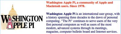
The new Pi Web site banner has essentially the same logo, but drawn out more horizontally, and done in shades of blue, white and red. On the right, a small photo of Pi members (from a Tuesday Night Clinic) has been added.
After donning its new XHTML outfit, the opening page of the Pi Website proudly passed an XHTML validation test at the W3C (World Wide Web Consortium.) While many consider such validation something akin to a vanity license plate, Lawrence correctly pointed out that such testing keeps our markup pure and honest. Mistakes do creep in, but intermittent testing can show us our errors so that we can clean up our markup. Clean markup will ensure that our pages run in the future as less forgiving, strictly standards compliant browsers dominate the scene.
Now that we had our markup in place, we needed to work on our new look and feel. One of the most dearly held principals of Web Standards is the separation of presentation and content—or to put it another way, design and information. The new pages themselves are very spare and contain only the essential XHTML markup. Where the earlier site was littered with such anachronisms as the deprecated font tag, the new site only includes essential information such as <h1> for heading level one, <p> for paragraph, or <br> for line break.
Before:
<
  h1><font COLOR="#FF3300">Welcome to Washington Apple Pi.</font></h1>
After:
<
  h1>Welcome to Washington Apple Pi</h1>
Colors, fonts, font sizes, and other presentational information are all written into two external style sheets. One of these style sheets is linked in the head of the pages, and it contains all of the information that the CSS-challenged Netscape 4 versions can understand. The other one is “imported” into the head of the pages, and it contains all of the presentational information that a fully standards compliant browser can understand. Since Netscape 4 doesn’t understand the @import directive, it merely ignores the more comprehensive style sheet and takes its orders from the first (linked) one. We solve our Netscape 4 support problem while at the same time providing all the glory of full CSS for those who have Web Standards supported browsers (i.e., Mozilla, Camino, Safari, Netscape 7.x, etc.). We go one step further, too. Even someone with Netscape 1.x should be able to access the information on the page. The design won’t be pretty, but it won’t crash the browser, either.
[We are well aware that Netscape 4, in all its many various versions, remains wildly popular with the pre-Mac OS X crowd. If you are using Netscape 4 and would like to update your browser to a Web Standards supported one, but are reluctant to leap all the way to Mac OS X, see the section on browsers in the References at the end of this article.]
The beauty of writing the design information into an external style sheet is that one need only write the declaration once, and it then cascades throughout the site to style every single instance of a particular tag. For instance, we added this information to our style sheet for the paragraph tag when it appears in our main content area:
#maincontent p {

    line-height: 1.7;

    font-family: "Lucida Grande", Verdana, Arial, sans-serif;

    font-size: 14px;

    color: #333333;

    margin-right: 60px;

    margin-top: 0px;

  }
Now, rather than have to include font tags every single time we create a new paragraph on a page, we need do nothing at all. The style sheet will automatically add all of the color, size, and other presentational information to each and every one of the paragraphs within our main content area. We could also create a separate paragraph style for a different area of the page. For instance, in our sidebar section, we have a sidebar paragraph style.
The other advantage of Cascading Style Sheets is that there are capabilities in them that plain old HTML does not have. For instance, CSS allows for leading (or line height) between lines of text. CSS allows for creating the look of a button for links with the use of text only. CSS allows for layering of elements. CSS allows for conditional hiding of various elements on the page. There’s much more, but let’s look at that last feature next.
One of the largest problems with devising a new design for the Pi site was the “links gone out of control” problem, especially on the opening page. Al Sparber at Project Seven created a wonderful navigation system that enables the expanding and collapsing of categories of links. After Lawrence organized the links into the categories he wanted, I put them into CSS button groups. Al’s script uses two CSS classes, one called “hideit” and one called “showit” to enable clickable buttons that hide and show all of the sublinks in a particular category. CSS has a “display” feature that includes a choice of “none.” The “hideit” class calls on “Display: none;” to hide the sublinks upon clicking the button. Now you see them; now you don’t!
The other beauty of this system is its accessibility. Unlike some scripts that crash older browsers that don’t “get it,” this system is completely harmless. Netscape 4 doesn’t understand what’s happening, and so merely presents the page with every link and sub link showing. The entire navigation set is presented, and stays presented, in its fully expanded state.
Our next choice involved using CSS-P (Cascading Style Sheet Positioning) for layout. Traditional Web pages use table cells with no borders to create layouts. A layout table might have a cell at the top to house the banner, a tall left-side cell to organize the navigation, and one or two cells on the right to support the content. The CSS-P we used, however, made table hijacking unnecessary. Instead, we give coordinates, the sound of which might remind one of a bingo game at the local church. Let’s look at how it works.
First we prepared the page with <div> or divisions. Here is our essential structure:
<
div id="logo">

<
img src="core_images/bannerbl.jpg" alt="Washington Apple Pi" width="726" height="118" /></div>

<
div id="sidebar">

<div id="navbar">

<
/div></div>

<
div id="maincontent">

<
div id=”footer”></div></div>
We have a logo area for our banner, a sidebar area for navigation and sound bites, and we have a main content area for the meat of the page. Once the page is divided into these sections, all we need to do is set the coordinates in the style sheet. For instance, here is the information for the logo division of the page:
#logo {

    margin: 0px;

    padding: 0px;

    position: absolute;

    left: 0px;

    top: 0px;

    width: 100%;

  }
First we tell the browser to forget its default margins. Most browsers have margins such as you have in your word processing documents. We wanted our banner to start right at the edges of the browser window, so we set the margin and padding to 0. We then told the browser that we want the logo area itself to hug the very top and left of the screen. We also set the width of the logo to 100% of whatever size window each person has open.
Here are the coordinates for the sidebar. Our “Bingo game” tells the sidebar division to start 150 pixels from the top and 10 pixels in from the left. The overall width of the division is 210 pixels.
#sidebar {

    position: absolute;

    width: 210px;

    left: 10px;

    top: 150px;

  }
The lovely thing about all of this is that if we want to change the entire look of the site some day—or even to decorate for the holidays—all we have to do is create a new style sheet. Every page in the site will obey the new design with one flick of the switch.

Well, how about images? All of this talk of technical matters leaves the impression that we didn’t agonize over the use of images. We knew one thing for sure: we didn’t want to load the pages with big images that would increase download times for our large population of dialup connection users. Our button techniques certainly contributed to the illusion of many images, but we did have to consider the “branding” of the Washington Apple Pi.
The Pi already had a very nice logo, but it did need modification to fit in with our purposes. The original has tan and white colors, and Lawrence really wanted to bring it more in line with our red, white, and blue color scheme. The first iteration did adopt blue for lettering, but the continued use of tan in the Capitol building troubled us. A little Adobe Photoshop and Adobe Illustrator magic gave us some blue tinting that we decided was just the right touch.
The next task was to explore the possibility of reducing our banner height for inner pages. It is quite all right to take up some valuable screen real estate for the banner on the opening page, but could we come up with a shorter version for content pages that needed all of the space they could get? After some experimentation, we accomplished this too, and a new “inner page” template was born.

The new Pi Web site banner for interior pages has essentially the same look as the opening page, but it is narrower and the photo has been removed. The intent is to remind people they are still on the Pi site, but without the added overhead of the full opening page identification.
Design problems were now solved, and it was time to look at our content. Contrary to what many designers believe, most people visit Web sites to find something or gather information. Beauty is nice, but not at the expense of the content.
Our biggest content problem was the sheer volume of text on the opening page. Random ideas and information needed some kind of organization to help the reader find things easily. To that end, the trusty and serviceable unordered list tag came to the rescue. I created a simple blue custom bullet image to use over and over again every time the style sheet recognized a list item.
And here we see yet another benefit of style sheets. By loading one style sheet that is used over and over again for use with each page, and with each style sheet writing information for each tag or selector so that each declaration can be used over and over again, the demand on server bandwidth is vastly reduced. “Write once, use many times” is the CSS mantra. In the case of our little bullet, download once, and use many times.
After all of our wringing of hands, it was time to use the templates on real pages. Lawrence wanted to use Server Side Includes (SSI) in our template so that if we made changes to any component, we would only have to upload one document. I separated each division of the page into its own separate document: the logo (or banner) area, the navigation/sidebar area, and the footer area. There were now three includes linked on the template page, as well as two style sheets. Now all Lawrence had to do was bring in content from each page of the old site into the “maincontent” division of the new template. Each page now had links in its head section to five external documents.
Now if we decide we want to decorate for the holidays, all we have to do
is adorn our banner with a few snowflakes or snowmen and upload it to the
server. The
banner is referenced in our logo include. Each page has a link to this logo include,
and so will automatically adopt our new winter banner with almost no effort!
We could also change anything in our style sheet and watch it cascade throughout
the site with the upload of one small text file!
The possibilities are virtually unlimited. The position of the navigation (now
on the left) is not hard coded into our page. It is only an attribute in the
style sheet. We can easily change the position to the right side of the page
by changing a few coordinates. Again, this change would reverberate throughout
the site with the upload of one tiny text file. Between SSI and CSS, we created
the lazy—and busy—person’s Web pages.
I must confess that Lawrence and I were rather satisfied with the result. We took a Web site that had evolved somewhat haphazardly over the years and gave it organization and class without demolishing its essential personality. It was time to move from its incubation period on the testing server to full implementation for the entire world to see on the live server. One morning I woke up and found the revised opening page and some inner pages appearing in my browser. Shyly, and with no fanfare, “new” the Pi site made its modest coming out.
Most people find the new site easier to use as well as visually more appealing. The pages use modern, compliant code that should stand for a long time to come. The efficiency of components makes updates and modifications a snap to render. Future updates to the Pi’s gateway to the world can be made without demolishing any content. Our new foundation makes it just too easy…
Designing a site with the CSS-P method,
http://www.macromedia.com/devnet/mx/dreamweaver/
articles/dw_extreme_css.html
Al Sparber’s Project Seven
http://www.projectseven.com/
The new Washington Apple Pi design is on the Pi Web site:
http://www.wap.org/
You can see the older design on the Internet Archive’s “Wayback Machine” site
(and yes, the URL is murderous):
http://web.archive.org/web/20010118200200/
http://www.wap.org/
Netscape browser archive (Netscape 7.02 is the last pre-Mac OS X browser
from Netscape):
http://wp.netscape.com/download/archive.html
Current Netscape browser:
http://channels.netscape.com/ns/browsers/
Camino browser (Mac OS X only):
http://www.mozilla.org/products/camino/
Firebird browser (Mac OS X only):
http://www.mozilla.org/products/firebird/
Mozilla browser: the last Mac OS 9-compatible version, 1.2.1, is available
here:
http://www.mozilla.org/releases/old-releases-1.1-1.4rc3.html
Current versions of Mozilla (Mac OS X-only) are available here:
http://www.mozilla.org/releases/
Safari browser (Mac OS X only):
http://www.apple.com/safari/
OmniWeb browser (Mac OS X only):
http://www.omnigroup.com/applications/omniweb/
Microsoft Internet Explorer (Microsoft seems to love ugly URLs):
<http://www.microsoft.com/mac/products/internetexplorer/
internetexplorer.aspx?pid=internetexplorer>