

Let’s face it: there are a great many things we do with our computers that have almost no useful purpose. On most days of the week, we don’t have a need to match orbital velocities, sequence DNA, balance the federal budget, or render a feature-length animated film. Instead, we do many things simply because they look cool.
And X Resource Graph, better known as XRG, looks cool. Yes, it actually has a purpose, even a useful purpose, but that is irrelevant: it fairly reeks coolness. And it is free.
Written by Mike Piatek-Jimenez, XRG is a system monitor. In simple terms, it reports back, using text and graphics, on the performance of your Macintosh. Such applications first gained popularity in the world of “big” UNIX boxes in the 1990s. UNIX system administrators loved to have system monitors running in an X-Window window, showing their powerful 8 and 12 MHz workstations doing world-changing things and displaying this awesome power with some crisp, impressive-looking charts and numbers.
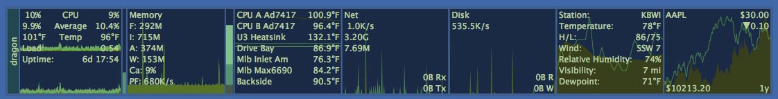
XRGquiet -- With the exception of the last two panels displaying weather and stock activity, X Resource Graph indicates this Mac isn’t doing much of anything. The panels, from left to right, are for the CPU, memory, temperatures from various sensors in the computer, network activity, disk activity, the weather at Baltimore-Washington International Airport (you can pick some other location), and the Dow Jones average plus Apple stock price.
But it is now the 21st century, and those “big” UNIX boxes are landfill, eclipsed in power, utility and ease of use by your iMac. And your iMac (or any other Mac running Mac OS X) can produce even crisper, more impressive-looking charts and numbers with XRG.
What kind of charts and numbers? Let’s take a look at the first screen shot, XRGquiet. XRG can be displayed vertically (the norm) or horizontally, and for purposes of illustration we’ve displayed it horizontally, and several times larger than normal. On the extreme left edge is the name of the computer, “dragon” in this case, and next to it is a panel showing CPU performance. Dragon has two CPUs, neither one doing much, one running at 10% of load and the other at 9%, and their average load is about the same. The CPUs are also running fairly cool, one at 101ºF and the other at 96ºF. Another load statistic is obliterated by one of the two performance graphics, and the last row of text shows Dragon has been up for six days, seventeen hours and fifty-four minutes.
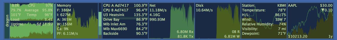
XRGbusy -- When your Mac is busy – and this one is very busy – the graphs tend to obscure the text. In this instance, both CPUs are very active, memory is very busy, the various temperature sensors indicate everything is running nice and cool, and there is considerable network traffic and disk activity.
The other panels show memory usage, various temperatures from the CPUs, heat sinks, fans and other parts with sensors (these vary depending on model of the Mac, with older Macs having fewer sensors), network traffic, disk usage (not amount of space, but the amount of read-write activity), and battery state (available only on laptops).
The final two panels do not have a thing to do with the perfomance of your
Mac. Instead, if you have an active Internet connection, the first panel
shows the
current weather (from a user-selectable reporting station), and the second
shows the Dow stock average and the current price of a stock of your choice,
in this
case Apple (APPL). Just as the other panels plot trends over time, the weather
panel plots temperature and humidity and the stock market panel plots the Dow
average over the last year and the yearly performance of your selected stock.
XRG allows you to select what information you want to display, and has customized “themes” allowing you to display that information in a wide variety of colors and font sizes. You can turn off any given display in almost any combination, you can display the graphs in dramatic colors that cry out for attention or that meekly fade into the background, and you can, as mentioned, vary the orientation and size.
When things get busy, as they are in the second illustration, XRGbusy, this little application is far more colorful. And far more useful: your coworkers, relatives, loved ones, and complete strangers will be impressed. It doesn’t make a bit of difference what your Mac is doing: the graphs show that it is working hard and, presumably, so are you.
Yes, it is useful. But beyond that, almost in spite of that, it is, simply: cool.
References:
You can download X Resource Graph from:
http://www.starcoder.com/xrg/
Be sure and check out the alternate “themes” for XRG:
http://www.starcoder.com/xrg/themes/sub_main.shtml